Depop Fit Confidence
The "Depop cinch" fakes a smaller waist than a garment actually has, and sizing is often buried in free text or missing entirely. I designed a fit-confidence system so buyers can trust what they're buying before sales-final purchase.
Sizing measurements are often buried in free-text descriptions, inconsistent, or missing entirely — and vintage sizing frequently doesn't match modern sizing anyway. Sales are final, so buyers can't reliably tell how an item will fit, which costs both buyers (regret purchases, hesitation to buy at all) and sellers (lost sales, disputes) confidence in the platform.
I framed the core problem as:
- Buyers who hesitate or back out of purchases because they can't trust how an item will actually fit — whether that's from missing measurements, cinched photos that distort shape, or sizing formats they don't understand.
- Sellers caught between what performs well (styled, cinched photos) and what builds buyer trust (accurate, structured fit information) — with no easy way to do both at once.
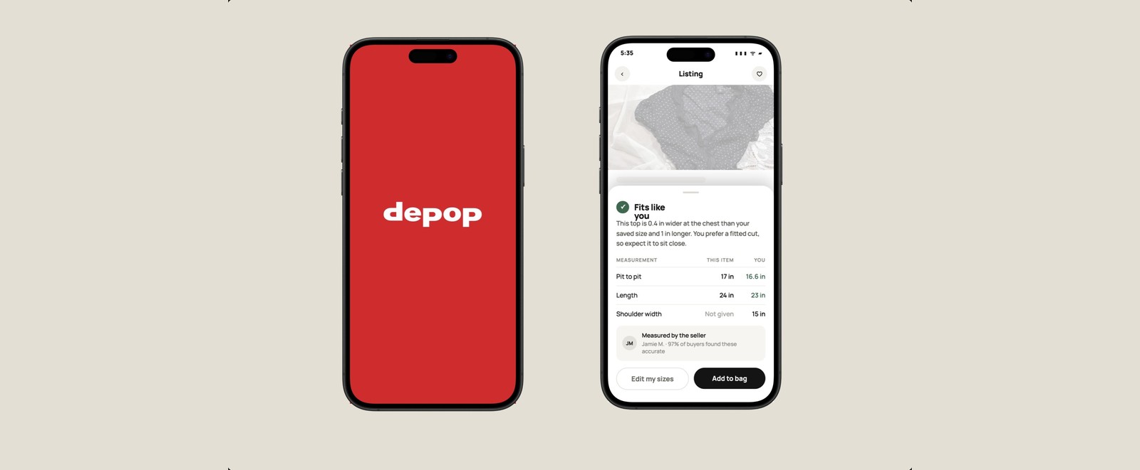
I designed a "fit confidence" system with three parts: a standardized measurement input for sellers with structured fields and guided photo prompts, a "fits like" comparison tool for buyers that checks listings against their saved measurements, and a trust signal surfaced directly on the listing card — not buried in the description.
- I noticed this through my own experience using Depop. I ran into this friction repeatedly while shopping, but assumed it was just my own bad luck, and it eventually discouraged me from using the app for a while.
- I later came across a TikTok poking fun at the "cinch" trend. Reading through the comments, I realized the frustration was widely shared, not just my own experience.
Three real listings show the pattern clearly.
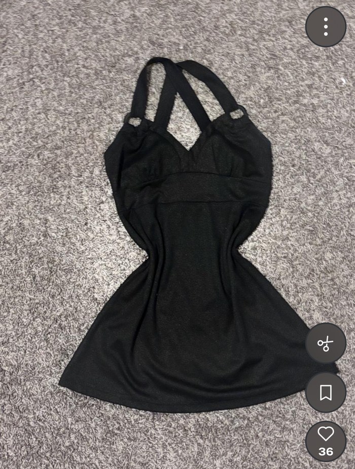
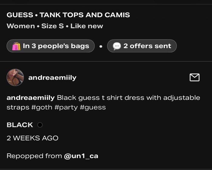
Cinching unnatural to how the shirt actually flows; no measurements listed, only one photo of the item.
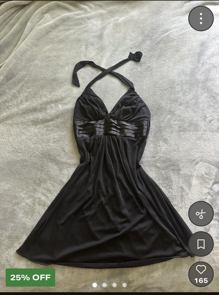
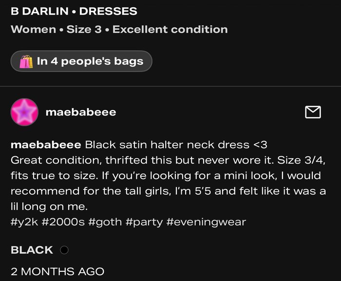
Description is written around how the item fits a specific height; sizing is inconsistent between the post (labeled a size 3) and the free-text description (labeled 3/4).
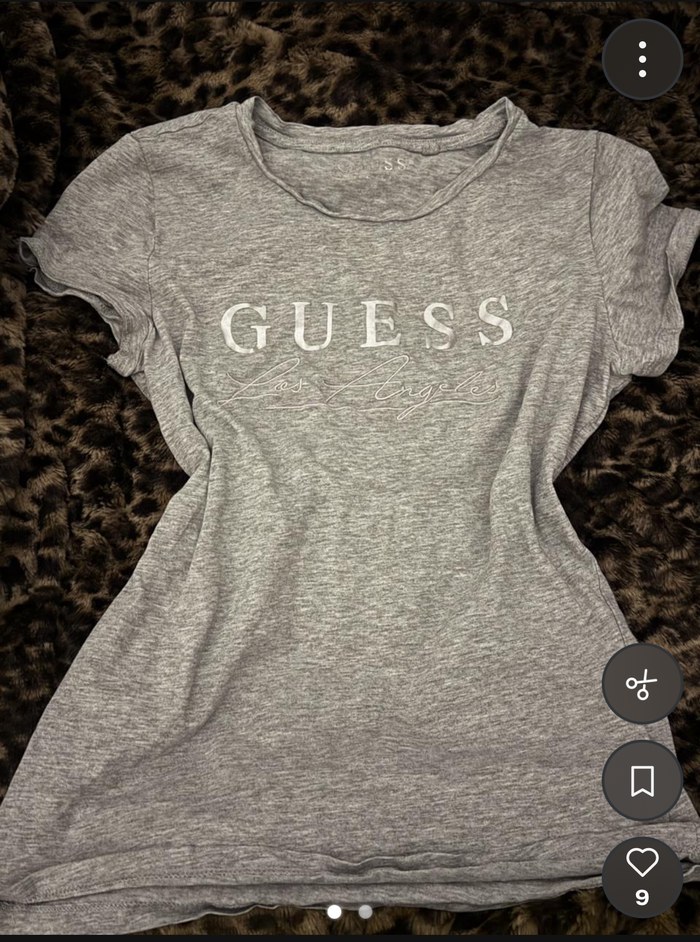
Unnatural cinching not at the natural waistline; no measurements provided.
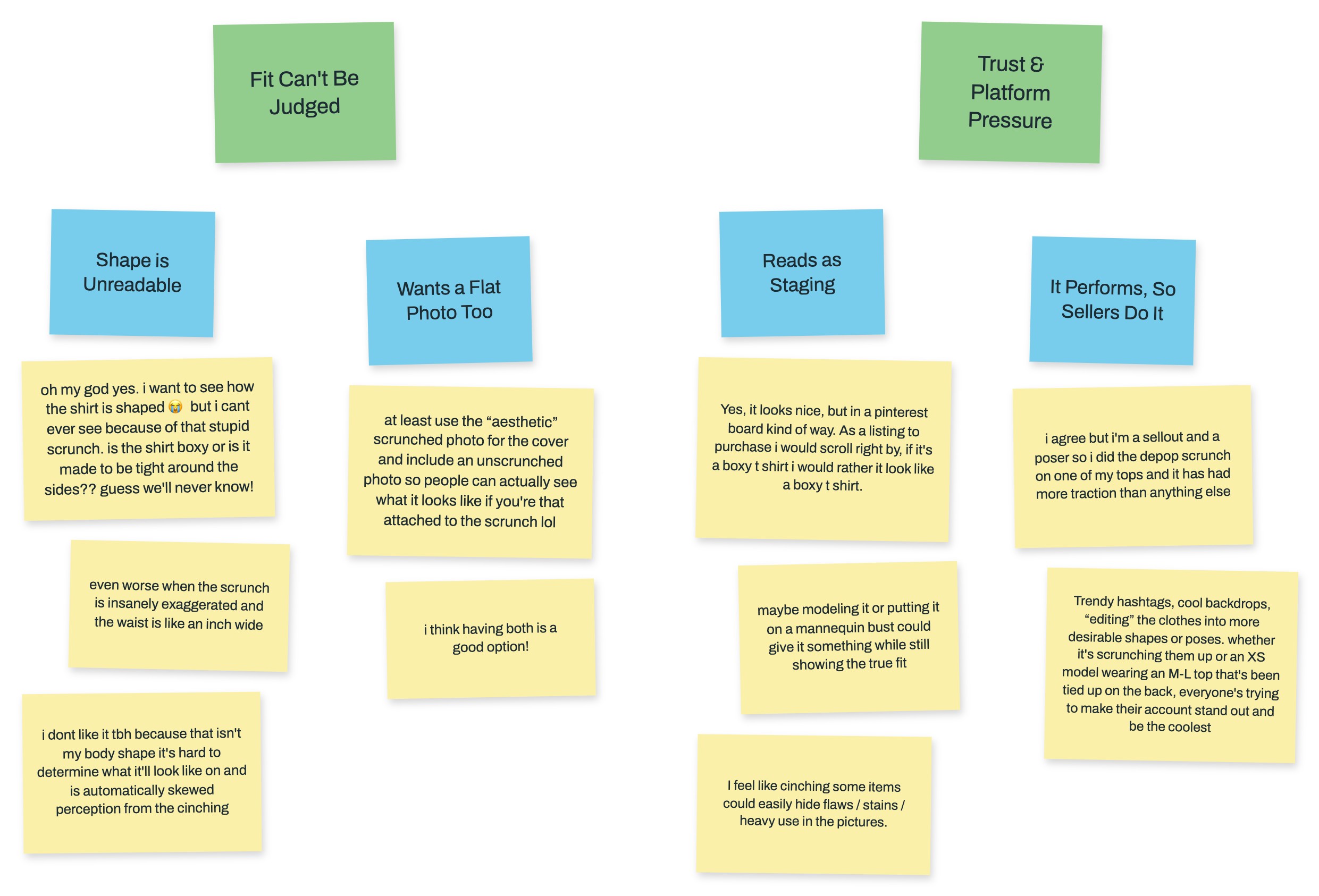
Reactions gathered from Reddit threads on the cinching trend sorted into two clusters: fit can't be judged, and trust & platform pressure.
24, regular Depop buyer — checks measurements and photos before buying when info is available.
- Cross-references photos and any listed measurements to estimate fit, but currently has no personal saved sizing to check against — everything is manual guesswork done fresh on each listing.
When a photo is cinched and no measurements are listed, she doesn't buy — she doesn't trust the listing enough to gamble.
What she needs from this redesign: a fast way to know a listing matches her actual size without doing mental math on every scroll — this is exactly what the "fits like you" badge solves for her.
Buys secondhand often but treats fit as a gamble — has been "burned" by purchases that didn't fit.
- Doesn't consistently check measurements, partly because she doesn't always understand sizing formats (mentioned confusion with Italian/French sizing).
Even when measurements exist, they're not always usable to her — the raw numbers don't translate to a confident decision.
What she needs from this redesign: not just the presence of measurements, but a translated, comparative signal — this is why the "compare to your sizes" table and the plain-language badge matter more for her than raw numbers would, and it's the strongest argument for personalization over just "add more data."
Sells regularly on Depop, aware that cinched/styled photos get more traction and engagement.
- Torn between using cinching because it performs better, and knowing it undermines buyer trust.
No structured, low-friction way to provide trustworthy fit info without sacrificing the styled photo that drives engagement.
What they need from this redesign: a way to have both — the styled cover photo and a fast, structured measurement flow that doesn't feel like extra work. This is why guided fields and diagrams matter: they lower the friction enough that accuracy isn't a trade-off against engagement.
- Cinching persists because it works. Buyers engage more with styled, cinched photos, and sellers have noticed listings gain more traction when styled this way compared to flat photos. This creates an incentive to keep using a technique that actively works against buyer trust.
- There's no standardized, required way to communicate fit. Measurements are optional, free-text, and inconsistently labeled, so even well-intentioned sellers produce listings buyers can't reliably interpret. Over time, buyers either disengage from measurements entirely (treating purchases as a gamble) or abandon purchases they'd otherwise want to make.
Whether sellers continue to use cinched or styled photos. That's a valid creative and marketing choice, and the data shows it genuinely drives engagement, so I'm not trying to eliminate it — the goal is ensuring accurate fit information exists alongside it, not replacing it.
- Standardized measurement input for sellers — structured fields (not free text) with guided photo prompts (flat, on-body, tag). Lives on the "list an item" page under item info; could be optional but strongly incentivized.
- "Fits like" comparison tool for buyers — buyers save their own measurements under a personalization/sizes setting, and every listing can be checked against them.
- Trust signal on the listing card itself — visible in the scroll/grid view, not buried in the description; can be toggled on or off.
Click through the hi-fi screens — each slide carries callouts on the key design decisions behind it.
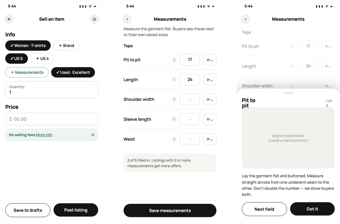
Depop's "sell an item" flow already renders a different size-input template depending on category (shirts vs. shoes vs. accessories). I extended that same pattern for measurements — fields need to be required for the system to work, but a required "waist" field makes no sense for someone selling a bag.
Making key fields required, paired with guided measurement diagrams (showing sellers exactly where to measure), is the strongest fix — stronger than just adding more fields.
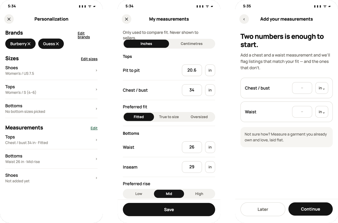
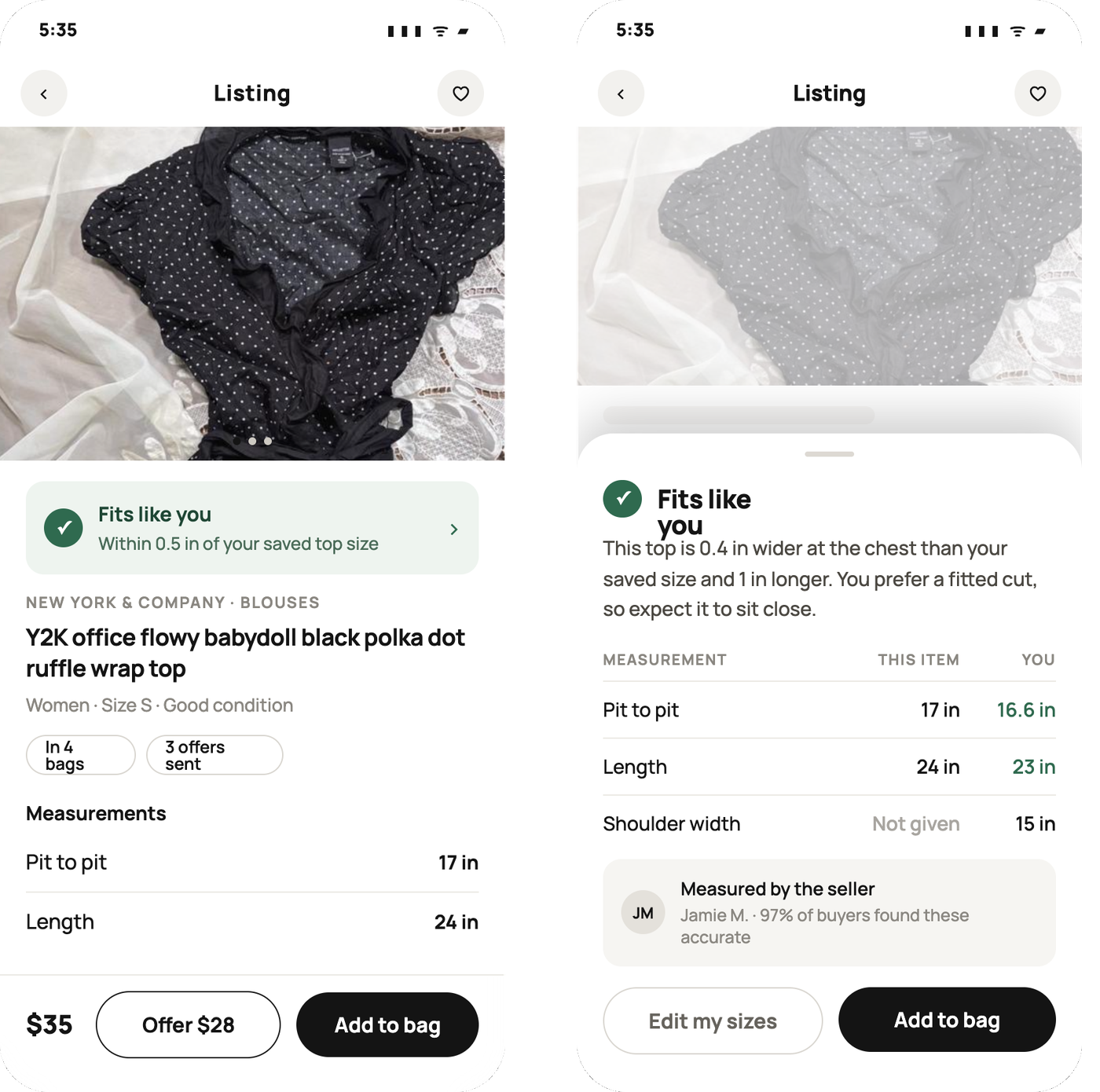
A percentage score can feel gimmicky unless it's backed by real data; "fits like" feels grounded in the buyer's own input instead of an opaque algorithm.
- Fits like you — measurements match the buyer's saved profile within a reasonable tolerance; the primary trust signal.
- Runs bigger — a graduated variant rather than a flat pass/fail; tells the buyer to size down or check details before buying.
- Add sizes — shown when the buyer hasn't saved measurements yet; doubles as a CTA nudging them to complete their profile.
- No measurements — shown when the seller never filled in structured data; a visual penalty for unverified listings.
Validates the design before it ships — does the "fits like" system make sense, and can people actually use it correctly, before measuring impact at scale.
- Goal: Does the "fits like" system make sense, and can people actually use it correctly — before you'd ever measure impact at scale.
- Method: Moderated 1-on-1 sessions, 5–6 participants (enough to catch most usability issues per standard research practice), using a clickable prototype.
- Tasks to test:
- "Find an item you think would fit you." — Tests whether the badge is noticed and understood at a glance in the scroll view.
- "Add your measurements to your profile." — Tests whether the sizing-input flow is clear enough that people complete it — the step the whole feature depends on.
- "You found a top marked 'runs bigger.' What would you do next?" — Tests whether the graduated signal (not just pass/fail) is actually interpretable, not just noticed.
- "You're listing a jacket for sale. Add its measurements." — Tests the seller-side guided input flow.
- What to measure:
- Task success rate — Did they complete it without help.
- Time on task — Especially for the seller measurement flow, since friction here is the biggest risk.
- Comprehension checks — After seeing the badge, ask "what do you think this means?" before explaining it — catches misread icons/labels.
- Think-aloud notes — On hesitation points.
This validates impact, framed as a hypothesis since there's no real traffic to test against. Worth being upfront in the case study that this is a proposed test, not a run one — that's honest and still shows strategic thinking.
- A (control): Current Depop listing card, no badge.
- B (variant): Listing card with "fits like you" / "runs bigger" / "add sizes" badge.
- Primary metric: Click-through rate from card to full listing, purchase completion rate.
- Secondary metric: Return/dispute rate tied to sizing complaints — ties directly back to the original research problem.
- A (control): Current free-text description field.
- B (variant): Structured required fields with a guided diagram.
- Primary metric: % of listings with complete, structured measurement data.
- Secondary metric: Listing completion rate — does the added friction cause sellers to abandon the listing flow? Worth naming honestly as the real risk of this design.